Broadacre City Typeface
Typeface Development | In-Progress
A typeface based on hand-lettered exhibition didactics from the 1930s.
THE ORIGINS OF BROADACRE CITY
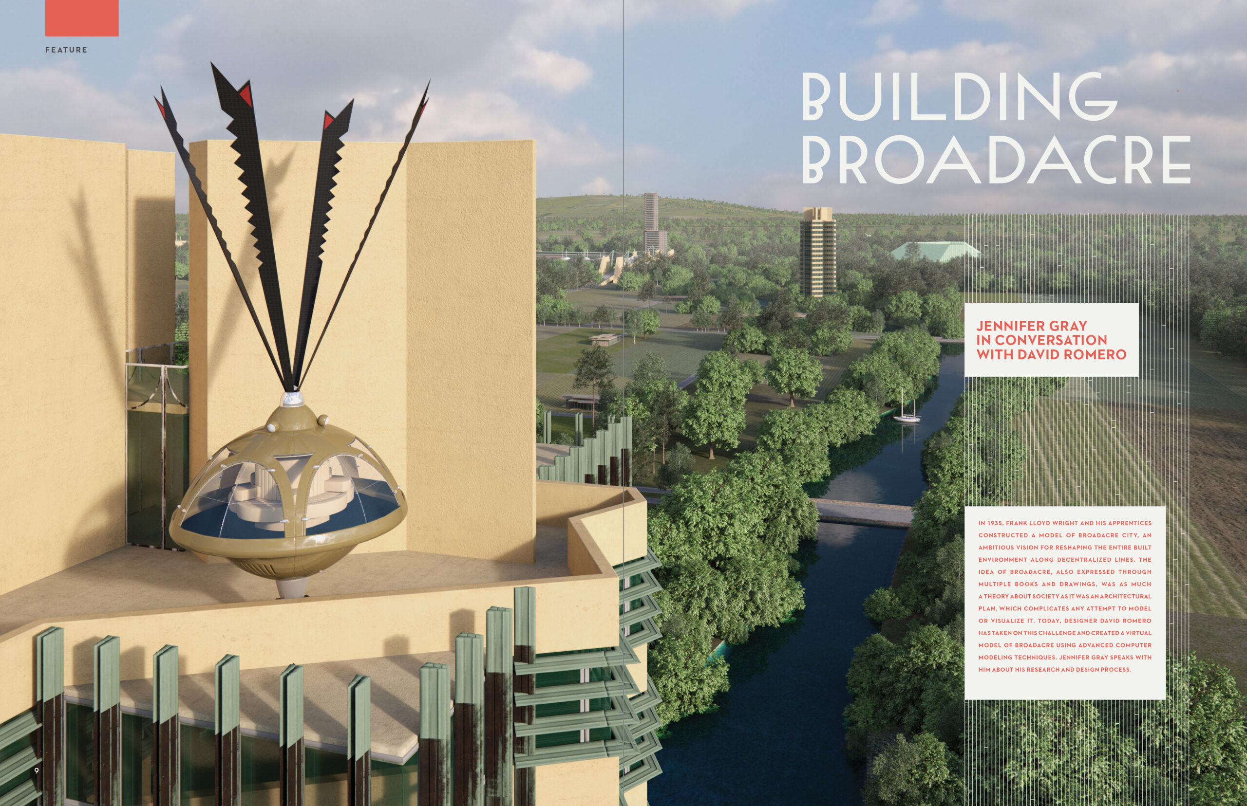
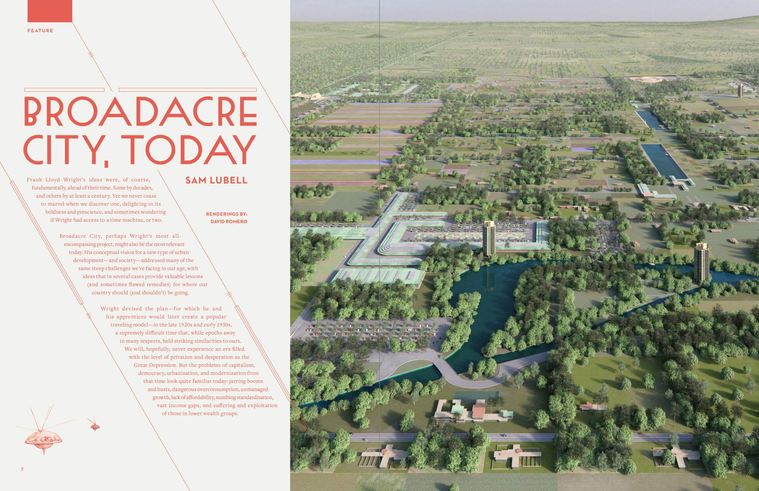
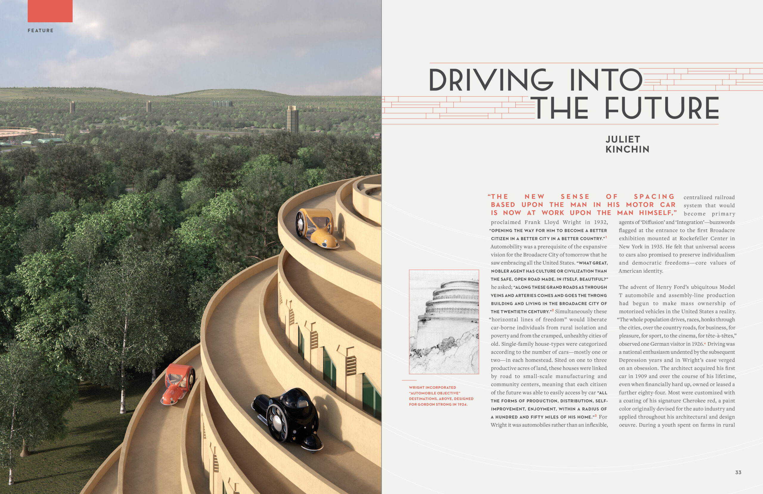
In 1935, Frank Lloyd Wright exhibited Broadacre City, a 'thought experiment' imagining the future of America's built landscape. First conceived in his 1932 book The Disappearing City, this was a project that he would revisit again and again until his death in 1959.
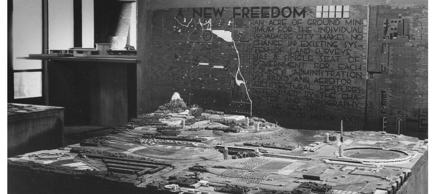
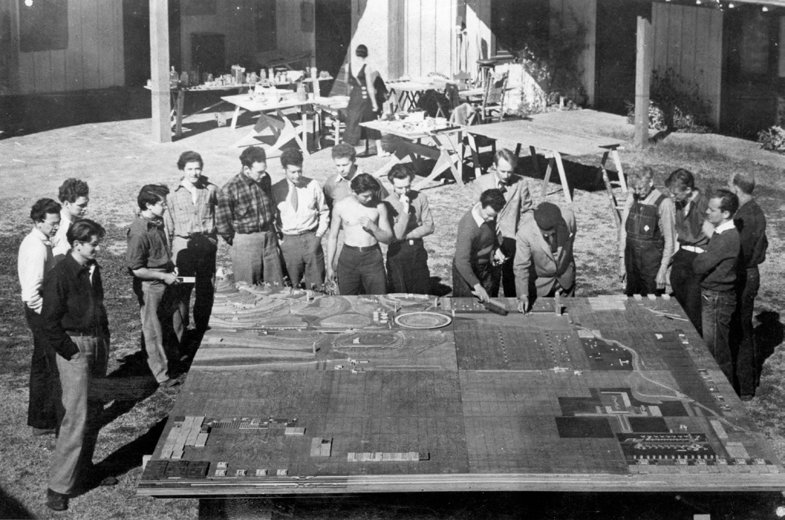
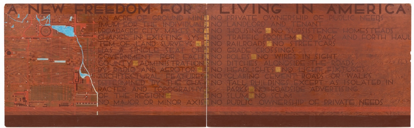
In the winter of 1934-35, Wright gave his vision a tangible form: a 12-foot square model representing 4-square miles of Broadacre City. In 1935, this model was part of an exhibit at an industrial arts exhibition at Rockefeller Center, later touring to other sites around the United States. Accompanying the model were a rendered site plan and a series of exhibition didactics (below) with letterforms hand-painted on wooden panels.
All images of wooden didactics and archival images of the Broadacre City project courtesy of the Frank Lloyd Wright Foundation.
THE BRAND OF BROADACRE CITY
Long before Helvetica and Paul Rand swept through corporate America, Frank Lloyd Wright was creating a brand for himself and his work. From the color red, to the red square logo he used to sign his drawings, buildings, books and sometimes stitched into his clothing, to a preference for certain fonts (Futura, it seems, was a favorite), Wright understood the idea of a "personal brand" long before it was a commonplace turn of phrase.
Broadacre City was no different. When working on the Winter 2021 issue of the Frank Lloyd Wright Quarterly, an issue centered on the project, we wanted the magazine to feel as though it was part of the identity originally conceived by Wright. Though similar to other typefaces used by Wright and his Fellowship,* the typeface featured on the Broadacre City exhibition didactics is unique to the project.
*The Fellowship refers to the school of architecture created by Wright in the 1930s. Created on the basis of "learning by doing", the apprentices would work alongside Wright in the drafting studios, learning not only about architecture, but also engineering and the arts.

THE TYPEFACE
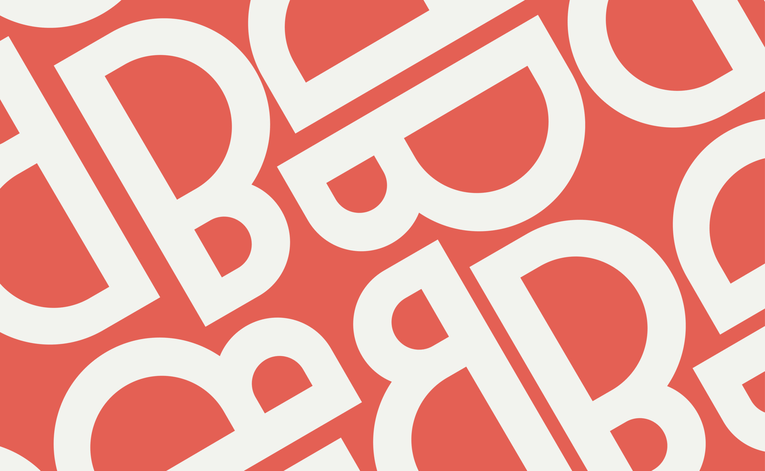
The typeface is characterised by its unbalanced B and S characters, with diagonals set on either 30 or 60 degree angles. A hallmark often found in work of Wright and his closest students, these angles can be found not only in the Broadacre City letters, but also in Wright's floorplans and graphic designs.
Developed for a special issue of the Frank Lloyd Wright Quarterly, the typeface was used for headlines and paired with House Industry's Neutraface, another font with architectural roots.