Curios: Why We Collect Things
Editorial | Art Direction | Photography | Personal Project
A colorful assemblage of pages celebrating the history and psychology of collecting.
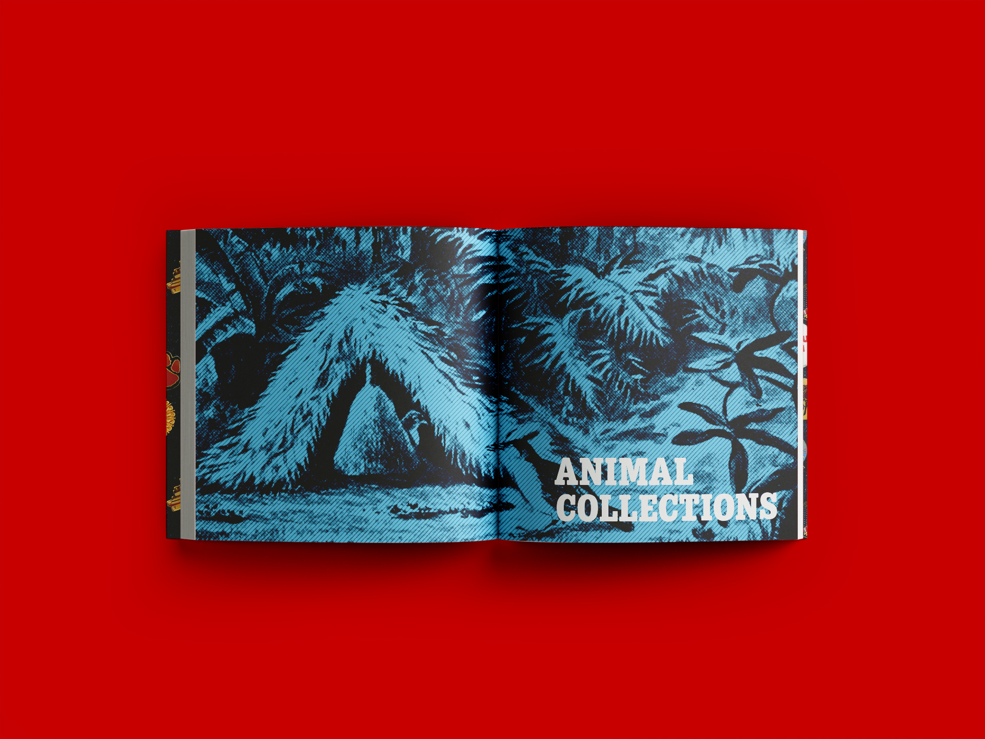
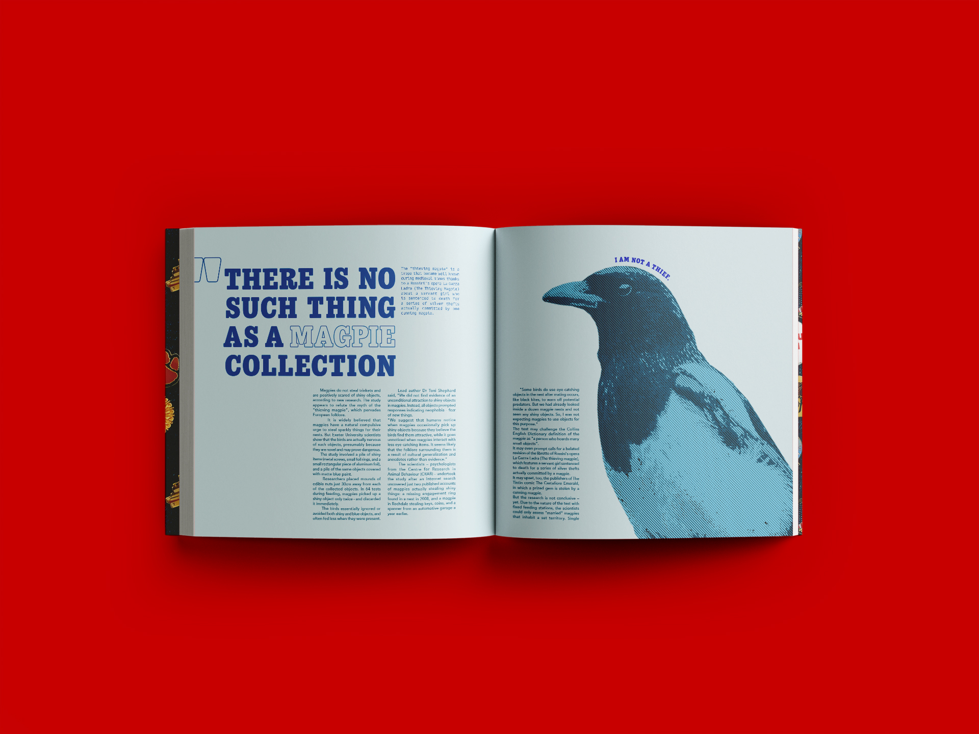
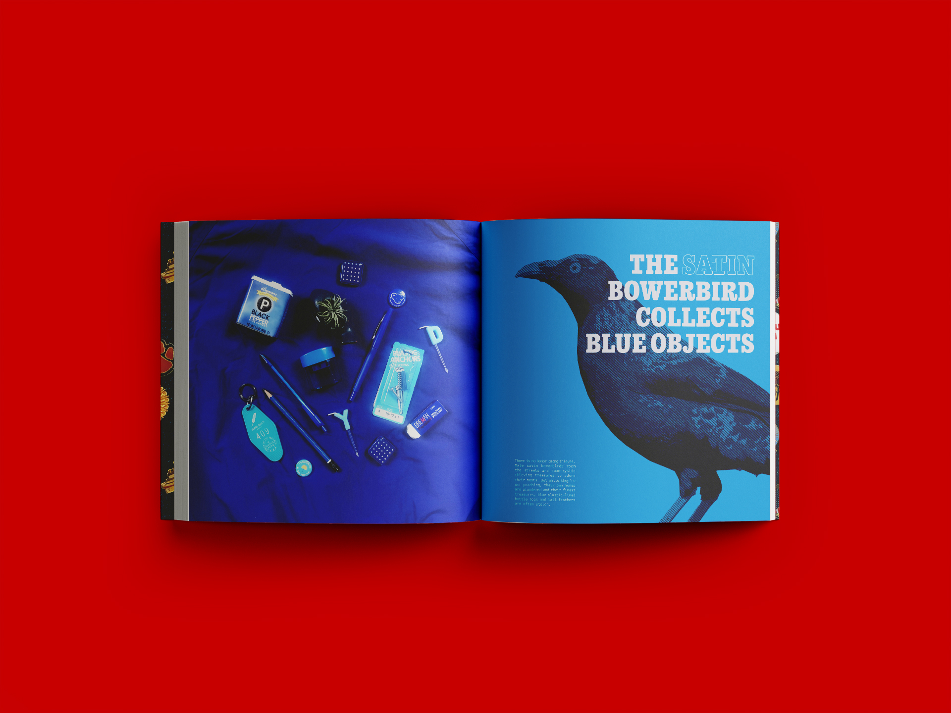
What is that one material thing that you just can't help but compulsively gather? Whatever it is, it’s human nature. Curios: Why We Collect Things explores the history and psychology of collections. From stamps to Longaberger Baskets, cabinets of curiosity to magpies, collecting is examined as behavior, but also as a way to understand the world we find ourselves within.

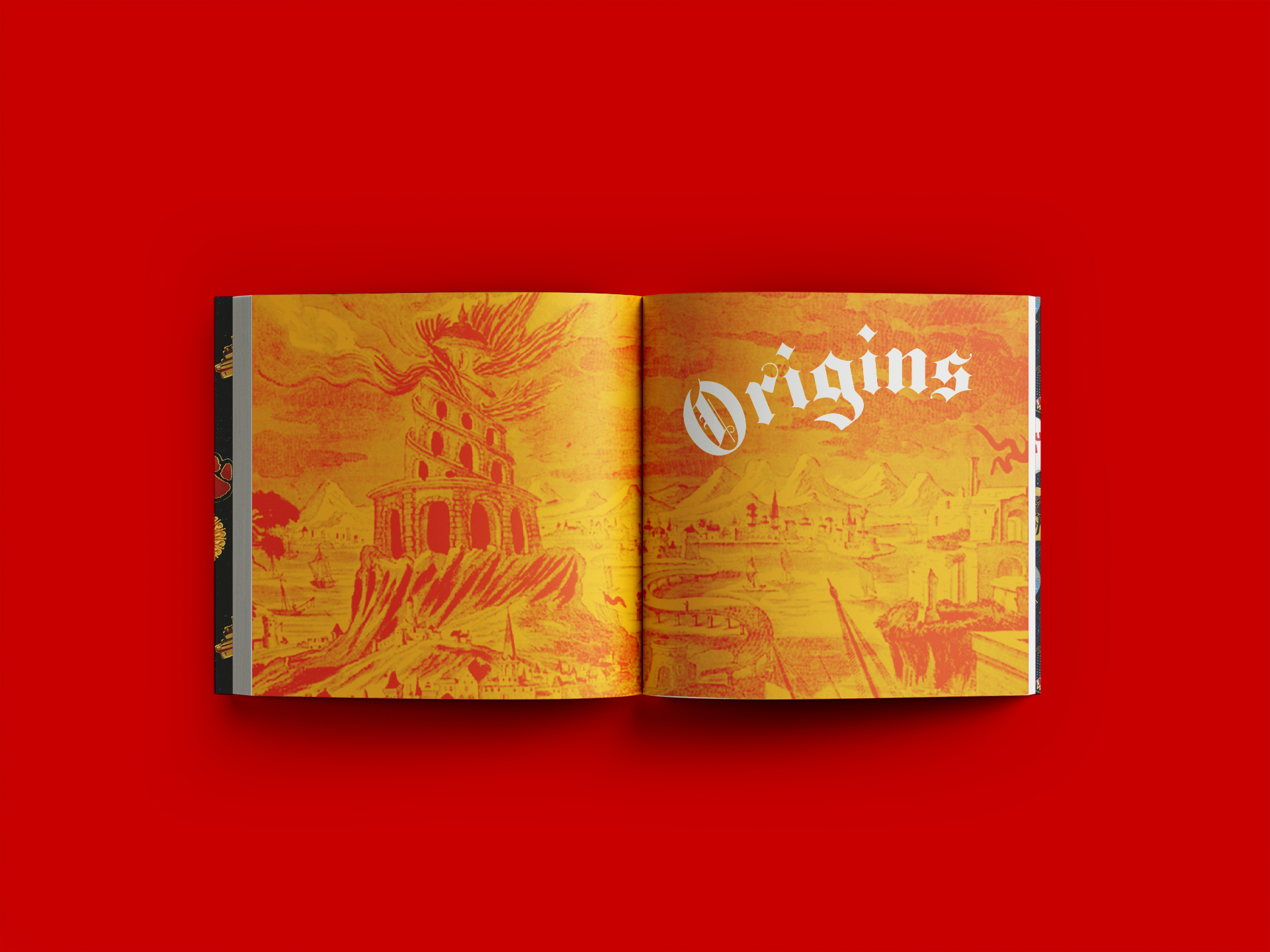
ORIGINS
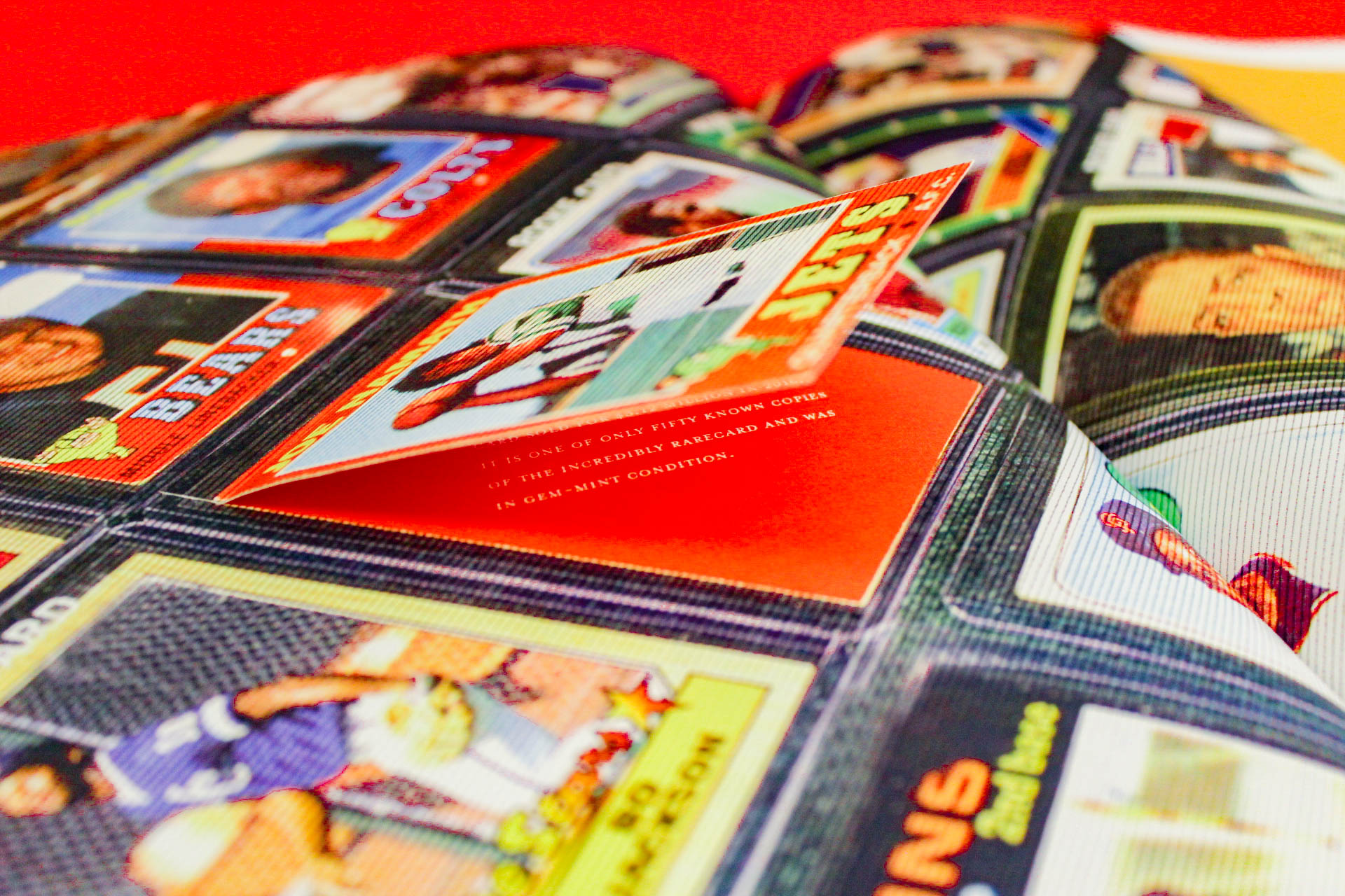
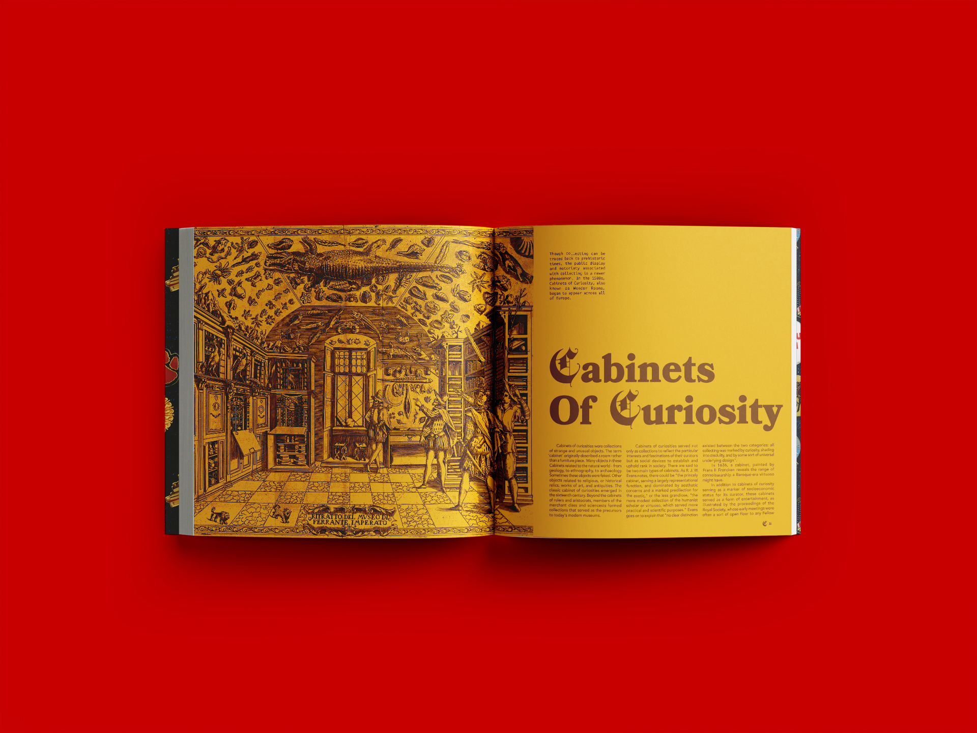
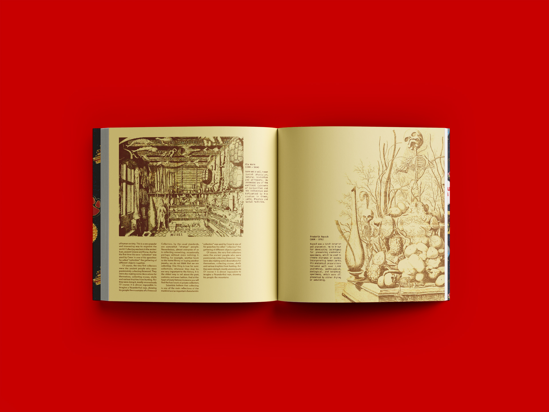
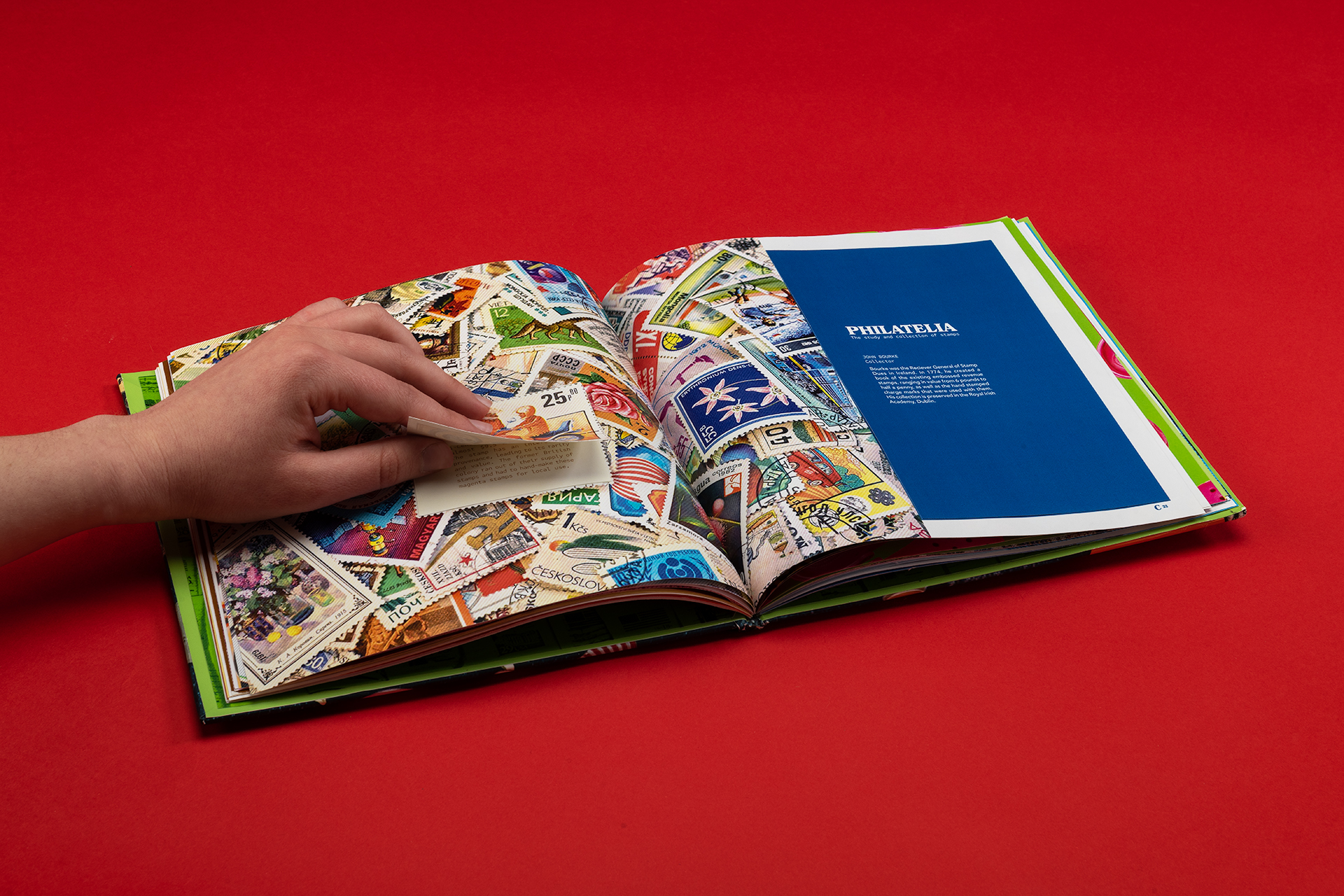
The book itself is a metaphor for collecting — words collected into paragraphs, paragraphs collected into pages, and pages into the book itself. This prevails throughout the designed details. The book strategically uses a collection of fonts — one representing each of the seven chapters. The ‘collected’ feel of the book is emphasized in the interactive elements including die-cuts, removable inserts and flip-up tabs.
