King's Head
Packaging | Branding | Naming
Strategy | Copywriting | Personal Project
King's Head celebrates the legendary history of cheese, rife with culture, revolutionary action, and 'beyond the cheeseboard' innovation.
At the heart of every legend, there is someone craving cheese. From the French Revolution, to riots in England, to naval battles in the Atlantic Ocean, cheese has a legendary past. Though it now often accompanies a glass of wine, it once accompanied a splash of blood and was far from the refined, elegant foodstuff we perceive it as today. King's Head pays homage to this history, repositioning gourmet cheese
NAMING
The King is dead, long live the Cheese! The name “King’s Head” refers to how King Louis XVI’s love for Brie cheese ultimately led to his death. As the story goes, the King stopped at an inn famous for its Brie while fleeing to Varennes. Not long after, the King was captured by the Revolutionaries and taken back to Paris for his execution.
STRATEGY
In developing a strategy, I studied how existing cheese brands present themselves and interact in this space. Three key things stood out: Within a brand, cheese types are often color-coded; More often than not, gourmet cheese brands lack a strong identity; There is often extensive text and little in the way of imagery on the package.
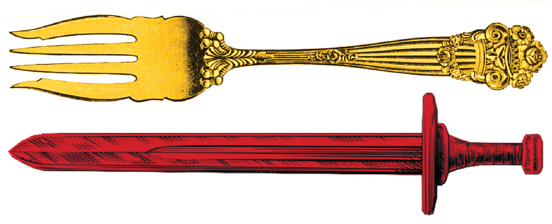
What makes King's Head revolutionary, is the way it commands an unrivaled presence amongst its contemporaries. King's Head is not for cheese coinsseurs. Its for beer drinkers who have never heard of a wine aerator and for those who would rather enjoy a snack platter during a football game than a charcuterie board in a white-table-cloth restaurant.
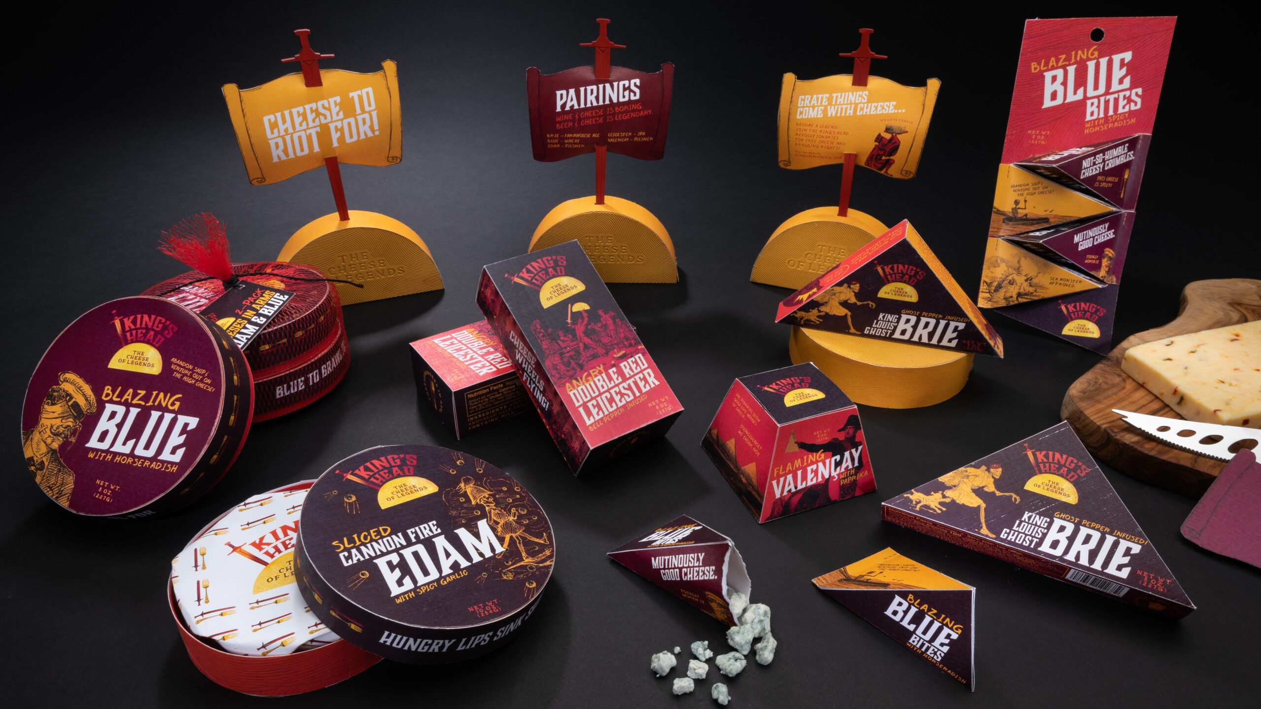
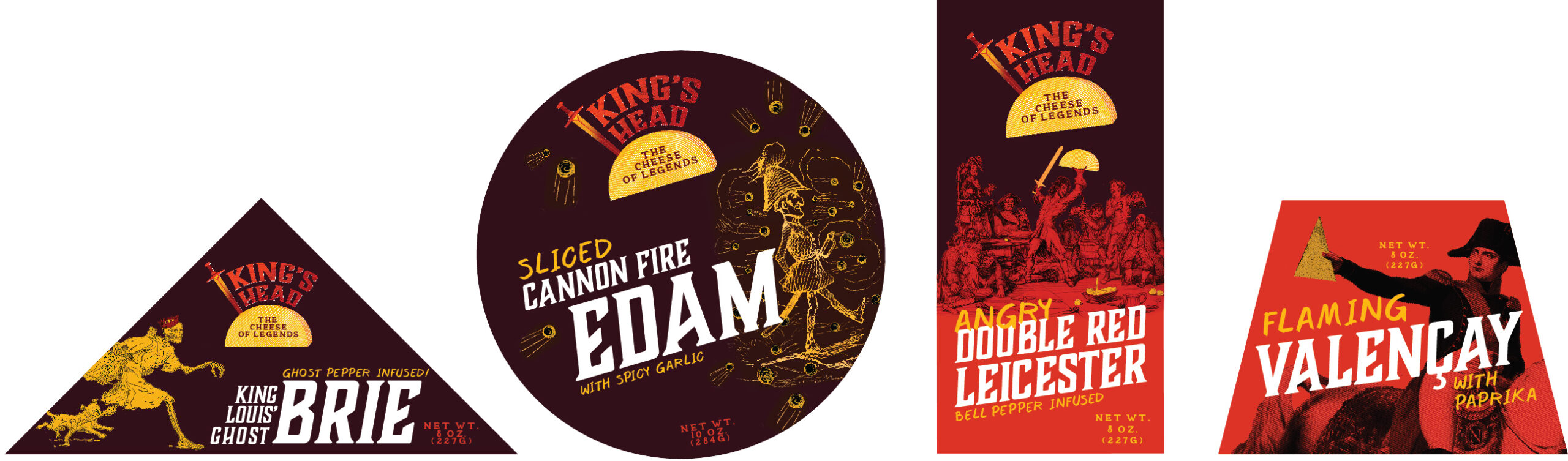
PACKAGING
King's Head's color palette stands out against the pastels of the cheese counter. Dynamic packaging shapes work to identify the varieties within the brand, reflecting the natural geometry of cheese while also nodding to the history of these legendary cheeses. Finally, King’s Head combines energetic typesetting with historic etchings to emphasize and ground the legendary history of the cheeses.
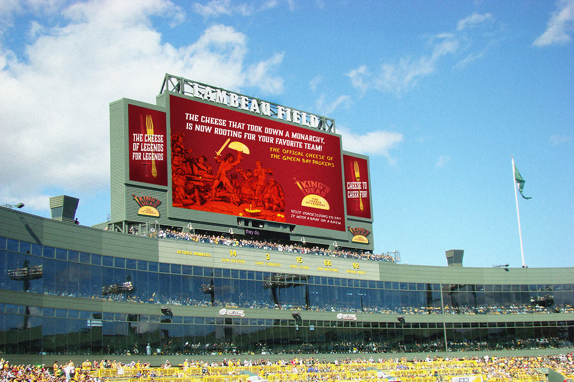
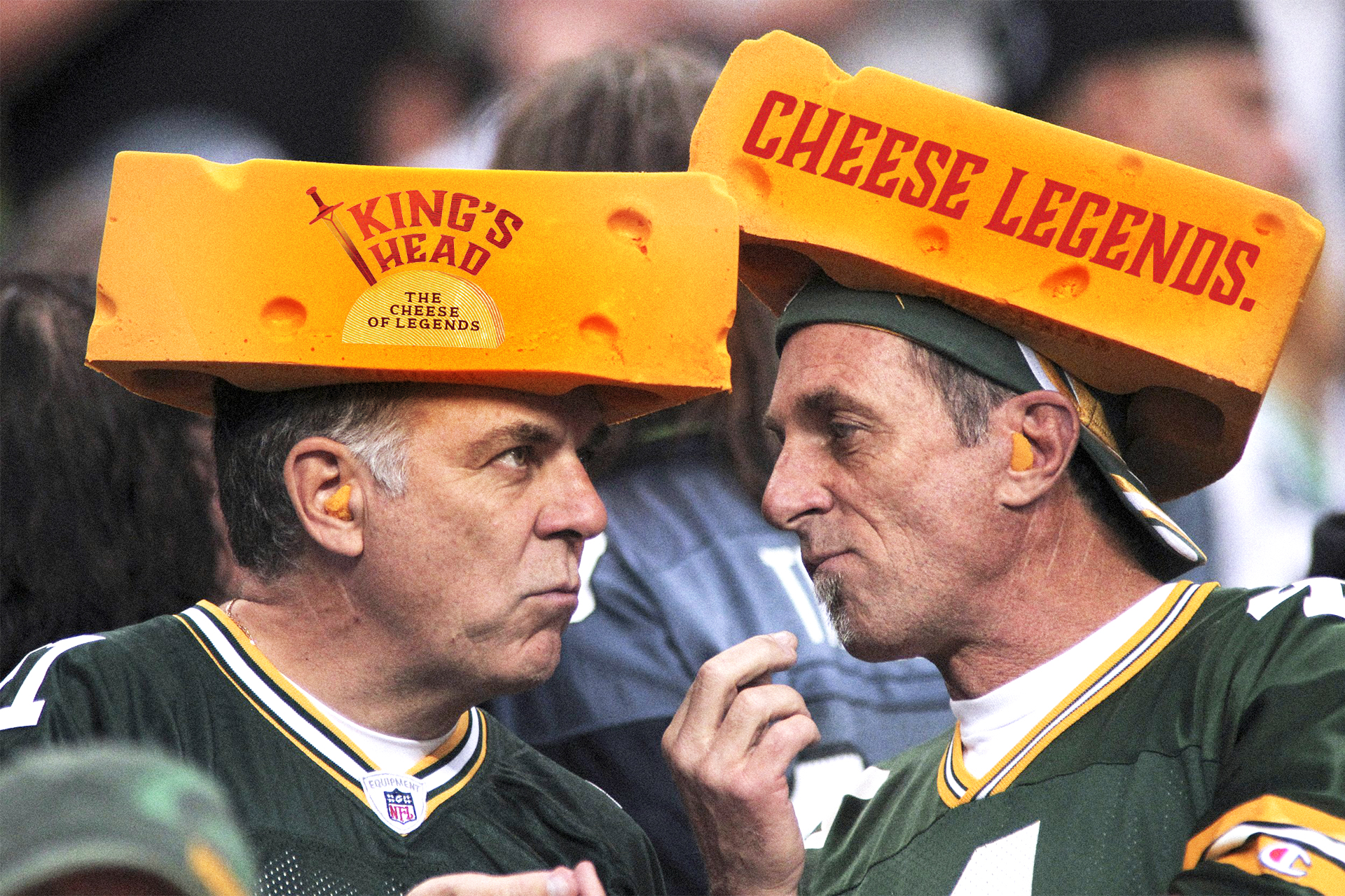
ADVERTISING
Cheese to cheer for! Always spoiling for legendary moments, King's Head is the official cheese of the Green Bay Packers. Promotional marketing and advertising can be found around Lambeau Field and is embedded within Cheesehead merchandise.